
Help Center
Layout & Composition
Creating a great design includes organizing the elements (layout) and creatively arranging them (composition) to communicate your message clearly. Our design team has assembled several rules of thumb to give you a good start when designing t-shirts, hoodies, or other apparel.
Create Focus
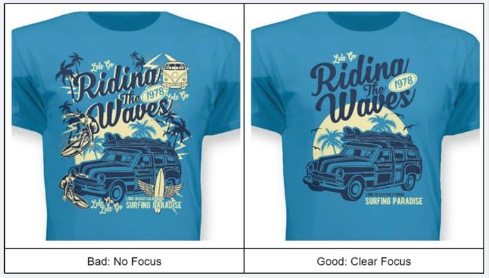
Your shirt design may contain several elements, but there must be one primary focus. The focal point is your most important statement!
Keep It Simple
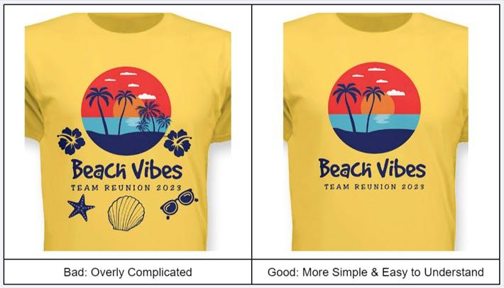
Applying simplicity is among the most powerful ways a design can be improved. The human eye can only process a certain amount of information at once; too many details can make the design difficult to absorb. So limiting the number of images, graphical elements, and pieces of copy will often improve a t-shirt design.
Be Complimentary
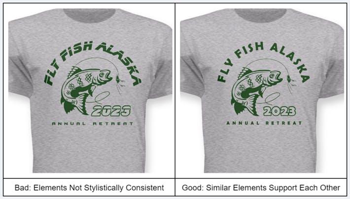
When assembling the elements of your design, use photos, fonts, and effects that complement each other. For example, a wild west themed shirt design could use photography with a sepia tone color palette (common to antique photos), an old west font like Gold Rush, and a distressed effect to the design to give it age. Each of these elements complements the other and produces a design that many will be seen as thematically consistent with the theme: Wild West.
Other ways to be complementary include:
- Use photos shot in a similar way
- Use similarly toned colors
- Use fonts & elements that are stylistically consistent
Use Contrast
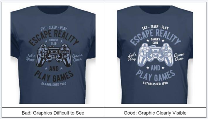
Contrast is the ability to clearly see the contents of a design by using different colors, so if visibility of the elements is important to make sure that they stand out. Issues can often occur when the coloring of design elements is too similar to the color of the underlying shirt.
Create Visual Hierarchy
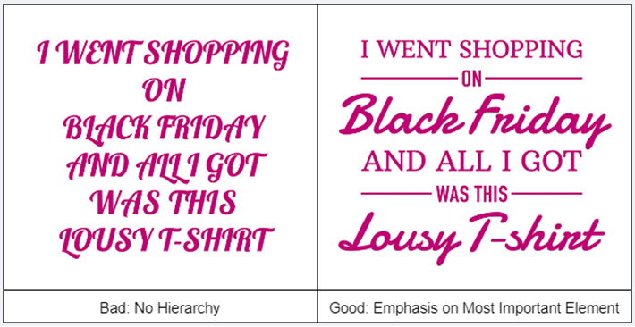
A visual hierarchy identifies the most important elements in a design and the selection of appropriate fonts is important. Also used with images and graphic elements, visual hierarchy can be communicated with fonts by:
- Order - Items placed first are typically interpreted as more important.
- Size - Larger items are believed to be of higher priority.
- Color - Higher contrast, brighter colors attract more attention.
- Effects - Outlines, underlines, and other effects suggest emphasis
Use 3 Fonts or Less
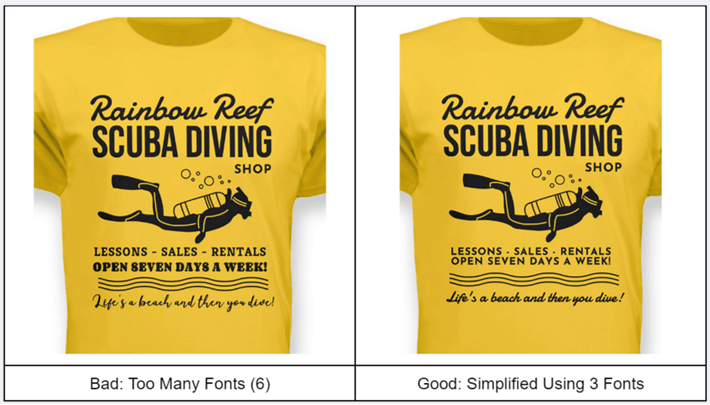
Balancing the number of fonts used in a design adds interest without becoming overwhelming. Using a single font for an entire design is boring while using a handful of fonts can make the design difficult to read and understand. Using three fonts is often a good choice because it provides for a:
- Bold or distinctive font for the main message, such as title or business name
- Smaller secondary font to deliver more information
- Different font for use with a tagline or less important information.
Pair Fonts Carefully
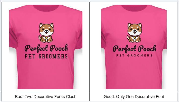
Every font is distinctive, so when using multiple fonts, take care to select those that are complementary and help clearly convey your message. Some simple tips include:
- Look for Contrast - Select one that is attention-grabbing; the other supportive
- Don’t Clash - Avoid those that visually or topically clash; you’ll know it when you see it ;)
- Avoid Too Much Similarity - Similar fonts make visual hierarchy difficult
Choose Appropriate Fonts
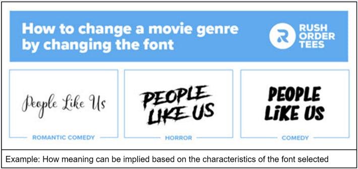
Fonts can have a dramatic effect on how your design is interpreted, so selecting appropriate fonts is critically important. When selecting a font for your custom apparel, consider the intended purpose of the shirt, the preferences of the wearer, and how the font will be perceived by those seeing the shirt. The font selected should not clash with the purpose of your design.
Want more guidance on fonts? Check out our blog post on Typography 101