
Help Center
Color Selection
The selection of color for use in a design is an essential part of an attractive design. Thankfully it’s not complicated or stressful; consider these guidelines before starting your design process:
There’s an almost unlimited number of ink and shirt color combinations, but careful consideration of ink color before you start will ensure that your shirt looks great and saves money. Options include:
Single Color
The application of a single ink color to a garment is "single color printing." Also known as one-color printing, it’s ideal for simple designs and is among the most affordable color options.
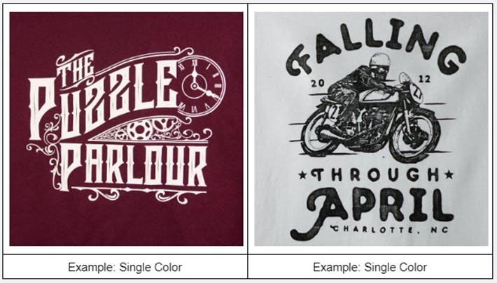
Halftones are an extension of one-color printing and can add interest without greater cost. They use shades of a single color and are easily set up.
Full-Color
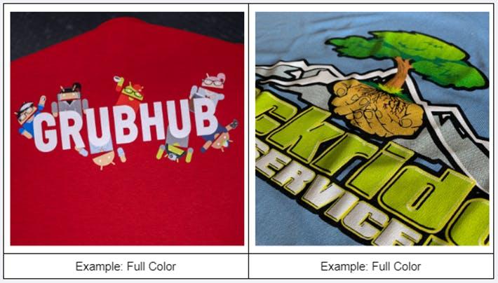
As the name suggests, full-color printing uses multiple colors in the design. While this can produce a vibrant result, full color can be problematic for several reasons:
- It can be more expensive
- More color may not add anything of significance
- It may undermine a professional appearance
- It may be inconsistent with the target audience
Specialty Inks
Offering a range of options to create a truly unique appearance, specialty inks feature different properties like:
- Texture
- Glow-In-The-Dark
- Metallic
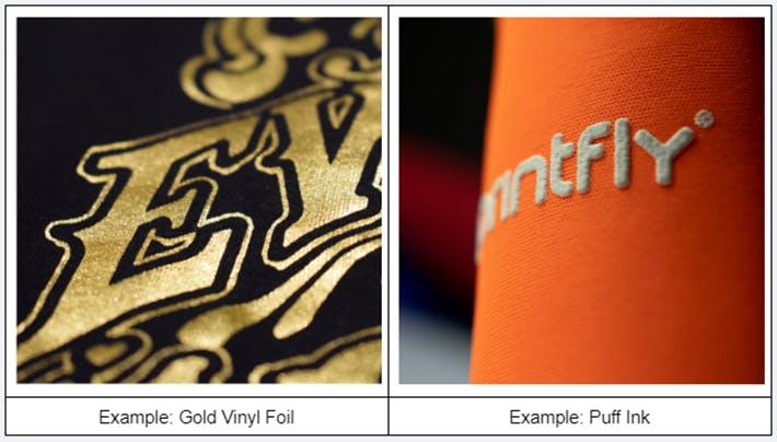
Learn more about our specialty ink options here.
Color Matching
Matching the design and shirt color with existing brand colors will ensure a clean, consistent, branded look.
RushOrderTees offers Pantone Color Matching as an additional paid service. The Pantone Color Matching system is a standardized method used to create an exact match to a brand’s selected color scheme.
Alternatively, Canva’s color wheel is one tool that will generate a set of colors based on a sample. These include color types like:
- Complementary
- Monochromatic
- Analogous
- Triadic
Color Contrast
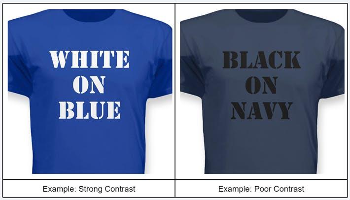
If you want others to see and understand your t-shirt design, the colors used must have adequate contrast. Contrast is the ability to clearly see the contents of a design by using different colors, so they need to be sufficiently different.
CMYK
CMYK is a color process used for printing, especially for photo-realistic images and those with lots of colors. Also known as 4 Color Process, it uses cyan, magenta, yellow and black. Create your images using CMYK if possible; otherwise, they will need to be converted.
Vector / Spot Colors for Promo Items
When designing hard goods—like pens, water bottles, and tech accessories—color works a bit differently than it does on a t-shirt. Most promotional products utilize Spot Colors rather than a blend of inks.
Spot colors are premixed, solid tones applied individually to the product surface. Because these items have smaller imprint windows, using solid spot colors ensures that fine lines and text stay perfectly crisp and readable without blurring.
To achieve a perfect spot color print, your artwork must be formatted as Vector Art (files ending in .AI, .EPS, or vector .PDF). Vector files allow our machinery to isolate each exact color block, guaranteeing sharp edges and flawless execution on hard plastics, metals, and fabrics alike.