
Help Center
Fonts
Font selection can have a significant impact on how your design is perceived. Fonts not only transmit written information, but they set the tone for the entire design and convey greater meaning. Based on our experience, we recommend the following tips to improve your designs using fonts.
Search For Different Fonts
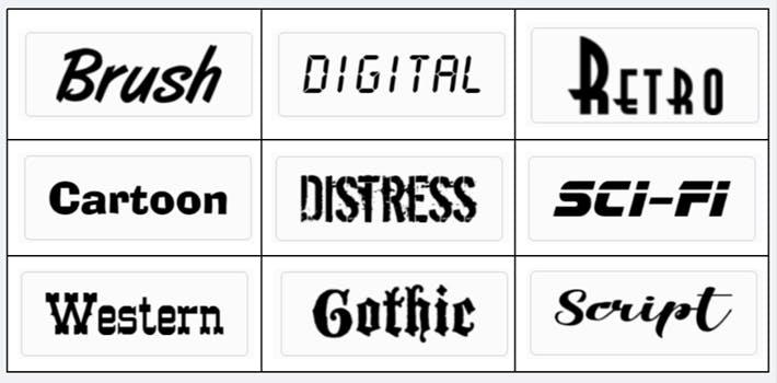
Font selection can have a profound impact on how people interpret your design, so we recommend selecting a font that is consistent with your message. While it can be time-consuming to find the perfect font, it can result in a much more cohesive design.
Just consider how the font used for each of these categories provides contextual meaning:
Visit our Design Studio to see our 300+ font choices.
Make Your Message Easy to Read
Communicating the message contained in your designs is of primary importance, so selecting fonts that are easy to read and understand is important.
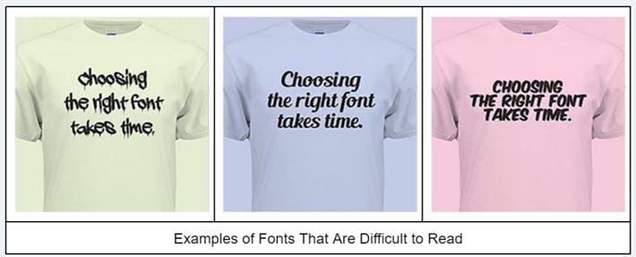
Some tips to make your message easier to read include:
- Use Decorative Fonts Sparingly
- Don’t “Shout” at People by Using All Caps
- Scale Fonts Proportionately to Avoid Stretching
- Create Visual Hierarchy Using Font Order, Size, Color, and Treatments
Choose Fonts That Are Appropriate
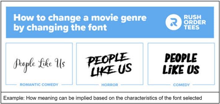
Fonts convey meaning and create an important first impression, so select fonts that are consistent with the message of your design. For example, a font applied to a non-specific movie title can set dramatically different expectations about what the film is about:
Use Three or Fewer Fonts
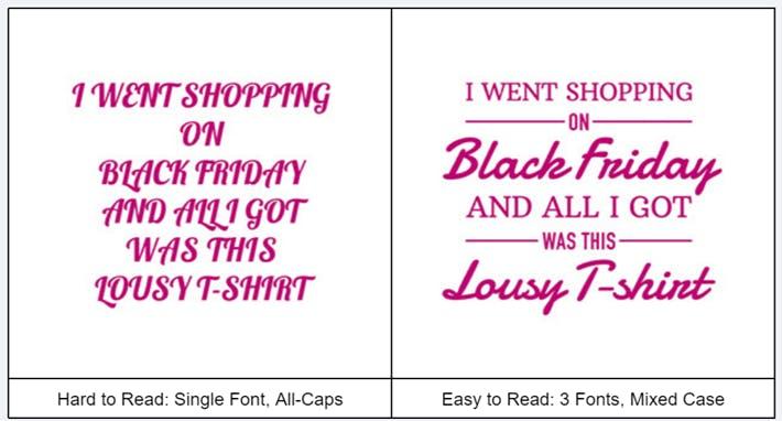
The use of multiple fonts can add visual interest and create a visual hierarchy, but a rule of thumb is to use no more than three fonts. Here’s one example of how impactful this simple rule can be:
Generally, we suggest selecting fonts as follows:
- A large, decorative, primary font to communicate the most important message
- A medium-sized, less decorative secondary font to use for supporting information
- A smaller, plain font (if necessary) to convey less important, detailed information
Interested in more information on how to select fonts? Take a look at our blog post 5 Simple Rules for Using the Best Fonts in Your T-shirt Design